You may remember that earlier this year, i announced that my Monster Alphabet hand-created typography had been chosen as one of the winning entries for Communication Arts' Typography Annual 3. The annual was published in January, and my collage typography was featured inside. I was also informed that, in addition to receiving a copy of the annual, each winning entrant would receive an Award of Excellence; an actual trophy! I was pretty excited to receive this beauty in the post this morning;
Showing posts with label Typography. Show all posts
Saturday, 27 April 2013
Monday, 22 April 2013
GETINCASED | Illustrated phone cases.
My illustrated iPhone cases have been available from my Society6 shop for a while, and during that time i've recieved various queries as to whether my phone case designs were available for other makes of phones too. Unfortunately they weren't at the time and, as I hated to disappoint people, i've always been looking into away to make this possible.
I'm now very excited to announce that my illustrated phone cases are available from GETINCASED! Yay! There are lots of different designs available for a range of phones - iPhones, Samsungs and Blackberrys!
I actually ordered a couple of my own designs; my favourites - the squirrel and the hedgehog; for my own phone; a Samsung Galaxy S2. It probably makes me a littttle bit of loser parading about with my own illustrated case adorning my phone, but this seemed like the perfect opportunity to try the cases out for myself so I could review the quality, plus I reallyyy wanted a cute woodland creature case for my phone! :)
I was very excited as my phone cases were delivered super quickly, and i'm very pleased with them. The quality of the cases are lovely - they seem fairly flexible but also feel very durable and strong. The cases themselves fit my phone perfectly and were very easy to fit, and the image quality is very high, which means the illustrations are beautifully clear, even all the tiny details! I'd definitely recommend them. :)
You can have a peek at my full range of phone case designs here! There's free shipping on all orders for all you lovelies who live in the UK, plus there's currently 10% off ALL your orders for my illustrated phone cases - yippee! Just use the code madiillustration at the checkout.
My phone is now encased in a super cute illustrated squirrel phone case! Love it!
Labels:
2013,
Blackberry,
Design,
GETINCASED,
Hedgehog,
Illustration,
iPhone,
Mobile phone,
Phone cases,
Samsung,
Squirrel,
Typography,
Woodland
Thursday, 14 February 2013
Earlier this week, I discovered illustrator Stephanie O'Hearne's lovely blog. I was having a little read through her posts, and amongst them I came across an awesome little post all about creating your own handwritten font! I have always wanted to design my own font, but quite honestly, I had absolutely no idea how. When I saw a link to a free online tool that makes it possible to design your own unique font using your handwriting, I was desperate to have a little try!
Yesterday afternoon was the perfect opportunity to try it out, and the process turned out to be incredibly straightforward. All you have to do is pop over to this website, print out a copy of the template, and fill in all the letters with a medium-thick black pen. Once finished, you scan the completed template, upload it, wait a few minutes and BOOM your very own font all ready to download! The best part is that, because it's based on your handwriting, it's guaranteed to be totally original. Yay!
[Yes, I even really did create little heart and star symbols as part of my font, I'm cool like that. Ha.]
I recommend experimenting with the thickness of pen you use to fill in the template, as it affects the boldness of the resulting font. My first font was originally written out using a medium-thick black marker pen; for the second, I used a fine-line black rollerball pen. I prefer the second font that I created, as the first is a little too heavy, although it may be useful if I require a bolder font one day.
I often struggle to incorporate text into an illustration, not in terms of composition, but because I usually find it difficult an appropriate font. The fonts I try never seem to suit the illustrations they are accompanying. I think this was a big part of the reason I originally began creating my own typography by hand; it was a way to create a style of text that I felt fit with the style of the imagery, as both were hand-created using a similar process. I tend to prefer the appearance of a more hand-created font, as it gives an illustration a sense of fluidity if image and text are of a similar style. Hand-created lettering has become my favourite way of adding text to an image, but there are occasions when cut-out or hand-drawn fonts are really suitable. I think this is a tool that I would definitely consider using if I required a proper printed font; it would be especially appropriate adding text to a children's picture book, as it has a fairly formal appearance, whilst still retaining a playful, handwritten appearance.
Labels:
Children's Book,
Design,
Fonts,
Illustration,
Typography
Saturday, 9 February 2013
Valentine's cards 2013 ♥
If you follow me on Twitter, or have had a peek at my shop lately, you may have noticed that I now have a new little collection of illustrated cards for sale! I've spent the past few weeks working away designing them, squealing with delight when they arrived, and then photographing them alongside pretty pink roses and loveheart sweets with super cute messages. Caught in a swirl of hearts and petals, I only just realised I haven't shared any of my new designs on my blog, and with Valentine's day only a few days away, it seems like the ideal time to give you a little peek! Even better is that there's still time to order one, and avoid a last-minute panic in Tesco, fighting over the last card left on the shelf!
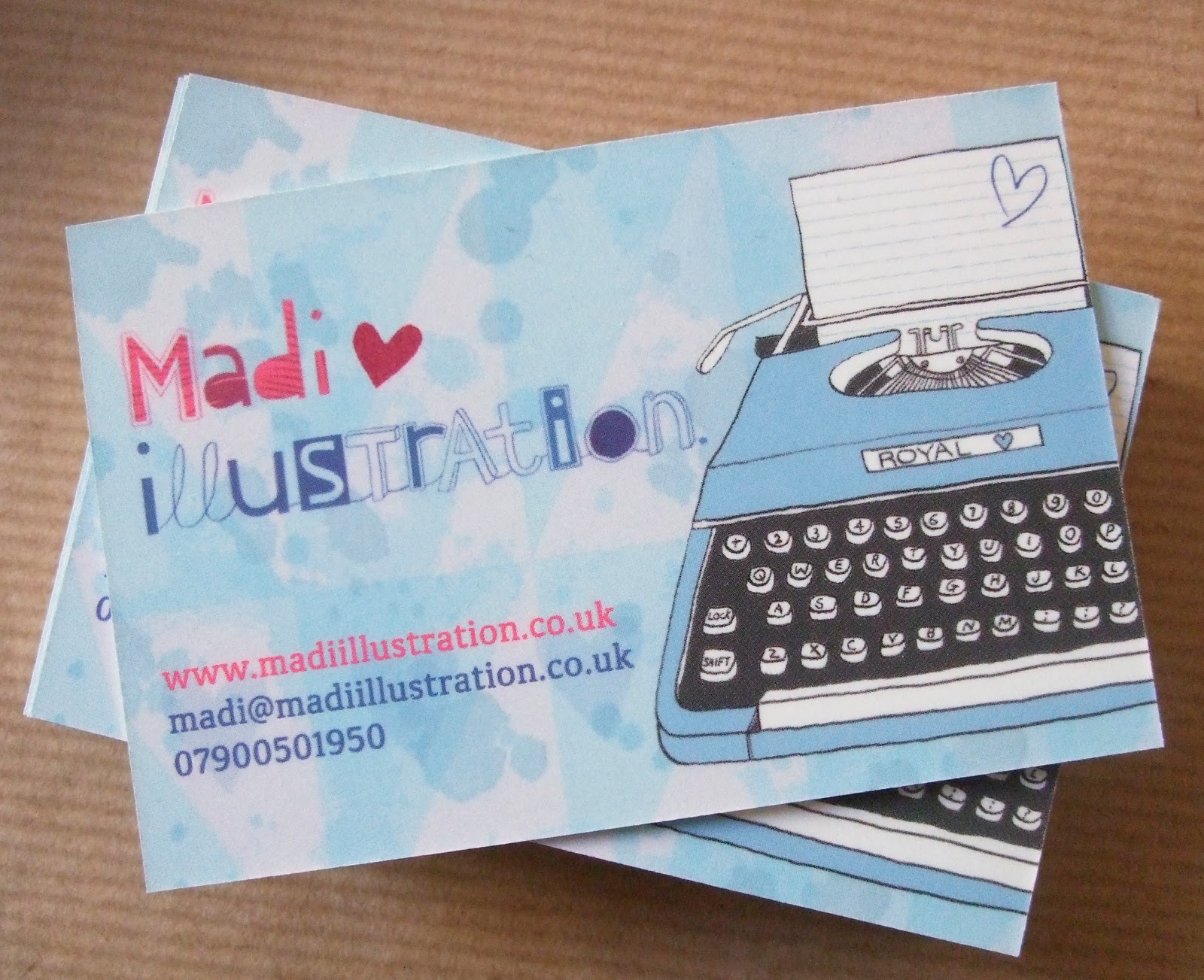
These are the three new designs;
![]() |
| P.s I Love You Typewriter Illustrated Card. |
![]() |
| Flamingo Love Illustrated Valentine's Card. |
![]() |
| You're My Favourite Illustrated Card. |
You may recognise my Flamingo Love design - it is an illustration I created a few years ago, but given the imagery, it seemed perfect to adapt into a Valentine's card. The design is also currently available to purchase as a signed print, or as a pretty illustrated pocket mirror - both of which would make lovely Valentine's gifts, if you're looking to earn yourself some extra brownie points this year! The You're My Favourite design is actually one I've been meaning to create for a while, so I'm pleased that I finally got round to it. The composition of this card proved to be a bit of a nightmare though, with two different layouts for the text, and almost equally split preferences between everyone I asked! It was a difficult, and last-minute, decision to decide which version to have printed - I was even a little nervous opening the parcel from the printers - but I'm very happy with the final result!
Of course, my other existing cards are still available too, and my Happily Ever After card is proving to be incredibly popular as a Valentine's card - romance clearly isn't dead! It's the perfect way to let that special someone know that they are the prince or princess at the end of your fairytale. Aww.
![]() |
| Happily Every After Illustrated Valentine's Card. |
![]() |
| If You Were A Crayon... Illustrated Card. |
The collection of cards available are pretty broad, ranging from super romantic and meaningful designs, to ones which take a more cute, quirky and playful approach; so whether you're selecting a card for the love of your life or your secret crush, you're sure to find one suitable! I'm sure your partner deserves to be treated to a pretty illustrated card, plus you can help support independent designers in the process. Yay! :]
So, where can you buy one? All five cards can be purchased in both my Etsy shop and my NOTHS shop, and are all now available to purchase with a 'send direct to recipient' option. This means that if you'd prefer, I can post your card of choice straight to your Valentine, complete with a handwritten message of your choice! It's the perfect option if you're buying a card last-minute, live overseas, or would like your identity as an admirer to remain a secret...
♥
Labels:
2013,
Cards,
Design,
Etsy,
Illustration,
Love,
NOTHS,
Promotion,
Typography,
Valentine's
Sunday, 3 February 2013
Incredible Illustrators | Anna Walker
One of the best parts about working in a book shop is that I have the chance to sort out, and display, the picture books. Obviously that means I need to have a peek through them all - my method of arranging involves displaying the books which have awesome illustrations, in addition to a selection of classic picture books I remember from my childhood, and any others I'm not so keen on are put back in the picture book pile. This has caused me to discover a number of children's illustrators whom I wasn't previously aware of. On my very first day at work last autumn, I fell in love with a couple of children's picture books - both of which were illustrated by Anna Walker. A little bit of research when I got home taught me that Anna is an australian illustrator, with a BA in Graphic Design, who has illustrated many books for children. Despite the fact that the books were very reasonably priced, I somehow managed to talk myself out of buying them week after week - I don't really need them etc - but then they were added to our January sale and, at only £1 each, it really would have been silly not to buy them!
The books I bought are entitled Yummy Ice-Cream and Let's Play House; both are from a series of books which feature three main characters - a panda, a sheep and an owl.
I was immediately drawn to these books due to the collaged aspects on the front cover - textures always seem to capture my eye, as they stand out against flat backgrounds. I had a quick peek inside the books, and totally fell in love with illustrations - a juxtaposition between the simplistic - and incredibly cute! - style of the characters and the collaged aspects, made up of a range of different fabrics. My work tends to be very intricately collaged, to the point where if you glance at a print of the original illustration, the textures and colours of the different papers used to create it are not always noticeable. In contrast, the illustrations in these book incorporate bold cut-out shapes of patterned fabric, and they stand out strongly against the subdued neutral colours of the ink characters and pale pastel-coloured backgrounds. Have a peek at some of the beautiful images for yourself;


I love how beautifully the textures of the fabrics are captured - the delicate weave of certain materials, and the individual frayed threads along the edges of the collaged shapes, are clearly visible - to the point that you want to reach out and brush away a stray thread, or feel the texture of the fabric beneath your fingertips. It gives the illustrations a certain depth and tactility that wouldn't exist in the otherwise flat, inked images.
The storylines of the books are simple, yet they both follow a narrative which sees the three characters playing together, sharing and having fun. Personally, I think the text inside the books would fit better with the style of the illustrations if it ... more hand-drawn style - perhaps similar to the style of text used on the first page of each book - but that might just be me and my love of hand-created lettering!


I'd actually quite like to buy myself a couple of the other books in the series, although I think I'm going to have to give one of these two books to my best friends' little girl. Pandas are her current favourite, so she will adore these books - I saw her yesterday, and she fell in love with my Topshop panda-face socks, so this seems like too much of an opportunity to miss! She can just about say panda-bear, and it's the cutest thing ever. ♥
Friday, 18 January 2013
Communication Arts | Typography Annual 3.
Having entered the AOI Images competition in the past, and never had any success, I have become a little wary of entering competitions which have an expensive entry fee. Last autumn, I debated whether to enter Communication Arts' Typography Competition - I think my hand-created typography tends to be pretty distinctive, so I thought it might catch the judges' eyes, but I didn't want to waste money. In the end I decided to take the chance, and ended up entering right at the last minute. I entered my collaged Monster Alphabet typography into the unpublished category.
In October, I was pretty surprised to receive an email telling me that my entry had been picked as one of 154 projects out of 1934 entries to appear in Communication Arts' Typography Annual 2013! Eeee! I only ordered my copy of the annual a few days ago, and was actually super surprised that it arrived so fast! Inside, amongst a whole range of inspirational typographic work, I found my Monster Alphabet!
Communication Arts' third Typography Annual features work from 21 different countries, and there's some really beautiful work included. I think it's possible to view the winning projects on Communication Arts' website, or you can buy yourself a copy of the annual here (it's super thick, so definitely worth it, plus it has that lovely freshly-printed-magazine smell. Yum). It's a must-have for anyone interested in typography or hand-lettering - my favourites include projects in the typeface design category, and also some of the calligraphy. In particular, I love this screen-print which was created by Office;
I was also pretty excited to find out that in addition to having my work printed in the Typography Annual, I will also receive an Award of Excellence - an actual trophy! Aces.
Labels:
2013,
Collage,
Communication Arts,
Competition,
Illustration,
Monsters,
Typography
Sunday, 16 December 2012
Little Monster's Gallery!
I have just received the very first entry for my Little Monster's Colouring Competition (and a very cute entry it is too)! As promised, I'm going to post all entries on my blog for everyone to admire, so this post will be added to as more artwork is received.
![]() |
| by Clara, age 8. |
![]() | ||||||||||||||||
Joint entry by Alex, age 5 and Alice, age 2.
|
Tuesday, 11 December 2012
Santa's little helper...
A little Christmas treat for you all! Keep the little ones entertained over the Christmas holidays - or get yourself in the festive mood - with this cute Christmas-themed colouring-in sheet. Please feel free to download and print copies for your little monsters, or yourself, to attack with their crayons - remember; you're never too old for a little bit of colouring-in!
You're probably already aware that I eagerly snap up any opportunity to draw monsters, so the chance to draw a monster in an elf costume seemed too fun to miss! As always, I would love to see your artwork, so if you, or your little ones, do have a go at colouring in the cheeky little elf below, please send me a photo of your finished pictures, and I'll post them all on my blog for everyone to admire!
I hope you all have a fun, creative and monster-filled Christmas! Ho ho ho.
*Remember to check out the freebies page for more monster-themed colouring fun!
Labels:
Children,
Christmas,
Colouring,
Illustration,
Monsters,
Typography
Wednesday, 28 November 2012
Hello new business cards!
I first designed myself some business cards back in my final year of Uni, and although at the time I was very happy with them, I decided recently it was definitely time for a new design. For a start, my old business cards don't display my logo, which means that they aren't consistent with my website, or the banner on my blog, or the cute little stickers I use when packaging items from my shop. Also, I think my style has developed considerably since leaving Uni, and I wanted my business cards to reflect my current work, rather than work I created years ago.
These are some of the designs I contemplated using;
Annnnd look what arrived in the post this morning! BOOM.
They have arrived justtt in time to take along to my very first craft fair this weekend! I will be selling Christmas cards, and lots of other illustrated goodies - perfect as Christmas presents, or just a little treat for yourself. If you live in, or around, Dorset then please come and have a peek - I'll even let you have a business card! The Christmas bizarre is taking place on Saturday 1st December in the Portman Hall in Shillingstone (near Blandford Forum), and is open 11am - 2.30pm. I've even heard a rumour than a certain red-suited white-bearded man will be making an appearance in the afternoon, so it's perfect for your little ones too! I'd love to see you there. ♥
Labels:
Business cards,
craft fair,
Design,
Dorset,
Logo,
Promotion,
Typography
Friday, 16 November 2012
The Green Door Bookshop.
You may have seen my post a few months back where I mentioned the work I had been creating for Caroline. I posted some of my initial designs for the branding of her new website. As I mentioned, the name of her website has changed since those early designs, and is now called The Green Door Bookshop. The website launched recently; it is an online bookshop selling gorgeous children's books, - books that are different, unique and quirky. These include titles from small publishing houses, and some self-published books too - including my illustrated picture book I'm A Little Bit Scared Of...
Below you can see some of the development of the branding/logo of the website, resulting in the final logo at the bottom which is visible on the website, plus bookmarks etc - exciting!
![]() | ||||||
Initial header design.
|
Subscribe to:
Comments (Atom)


